| The Main Shortcut |
|---|
The Main Shortcut
By intention, this is the top-most option in the "Main" part of the Zingoolarity home page or the main menu.
It is not a functionality in itself, but will invoke the "Contextmap" view on the top-most topic in the topic hierarchy (which is by default called "Home", but can be renamed if needed).
The idea behind this is that when you start using Zingoolarity to model and support your product organization, you create a "landing page" or "home page", which contains all relevant entry points to your information.
The default view is "Contextchart", because the first thing people should see when visiting your product organization is the contextual overview of the relevant pieces which are its building blocks.
This could be for example:
- Line Organization (involved parts of the overall company)
- External Partners (providing additional resources)
- Product Map (lanes, domains and products based on your business domain map)
- Application Map (overview of your current and target architecture)
- Company Strategy (overall strategy, vision, mission and concrete goals)
- Strategic Initiatives (themes, initiatives, projects and programs)
- ...
And here is how such a setup may look in Zingoolarity:
(Example of a Zingoolarity main page)
In the following chapters you will learn how to setup something like this and how the 3 main views and all other parts actually interact.
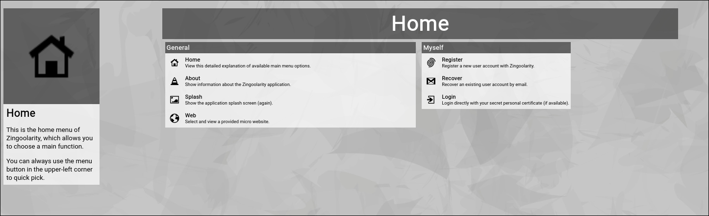
Select the "Main" option from the Zingoolarity home page or the main menu.
As already explained, you will be thrown into the top-most "Home" topic of your Zingoolarity instance in Contextchart view mode.
At the beginning, you may achieve the same effect by selecting the "Contextchart" option from the Zingoolarity home page or the main menu.
The difference is that the "Main" option will always return to the top-most "Home" topic (while switching to the Contextchart view) and the "Contextchart" option will resume where you left off (if you focused on another topic in the hierarchy and for example resume working on the next day, the "Contextchart" option will automatically return you to the topic you have previously focused).
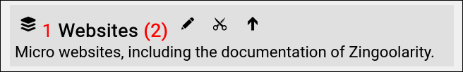
If you select the "Main" option on a fresh installation of Zingoolarity, the "Home" topic will be boringly empty:
(Boringly empty Zingoolarity "home" topic)
Let us first have a look what can be seen here:
On the left, you will see the so-called "breadcrumb" (starting with four icons); it always shows the full path to the currently focused topic, which is currently the top-most topic called "Home", with a small arrow on the left of it.
The arrow is actually a short cut to edit the associated topic directly (which is explained in detail further down in this chapter).
Clicking on a name in the breadcrumb will "drill into" the topic (which is also explained later).
The left-most icon toggles between "Editing" and "Presenting"; the default is "Editing".
Presenting hides all the small buttons, so that the display appears to be more "uncluttered"; this is helpful if you want to communicate and explain a view during a presentation.
The next three icons allow you to quickly switch between the three view modes (from left to right):
- Roadmap
- Kanbanboard
- Contextchart
At the moment, "Contextchart" is highlighted, as this is the current view mode.
And finally, the small "plus" button allows you to create a new topic below the currently focused topic. |
| Configuring the Home Topic |
|---|
Configuring the "Home" Topic
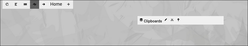
Let us start by configuring your top-most topic, which is the "Home" topic and (at the beginning) is the only topic existing (with the exception of the "Clipboard", which we will ignore for the moment).
The breadcrumb allows you to invoke the topic editor screen of any topic by clicking on the small arrow left of the topic name in the breadcrumb.
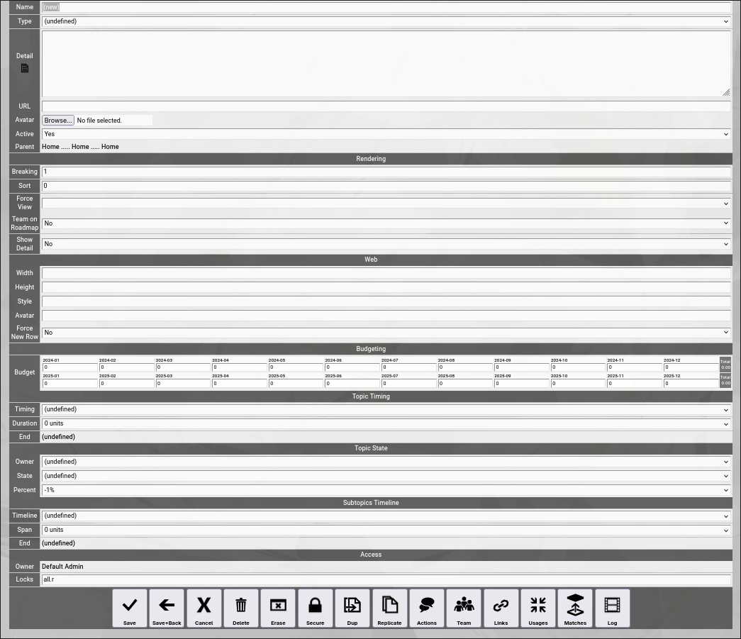
This will actually invoke a screen like this one:
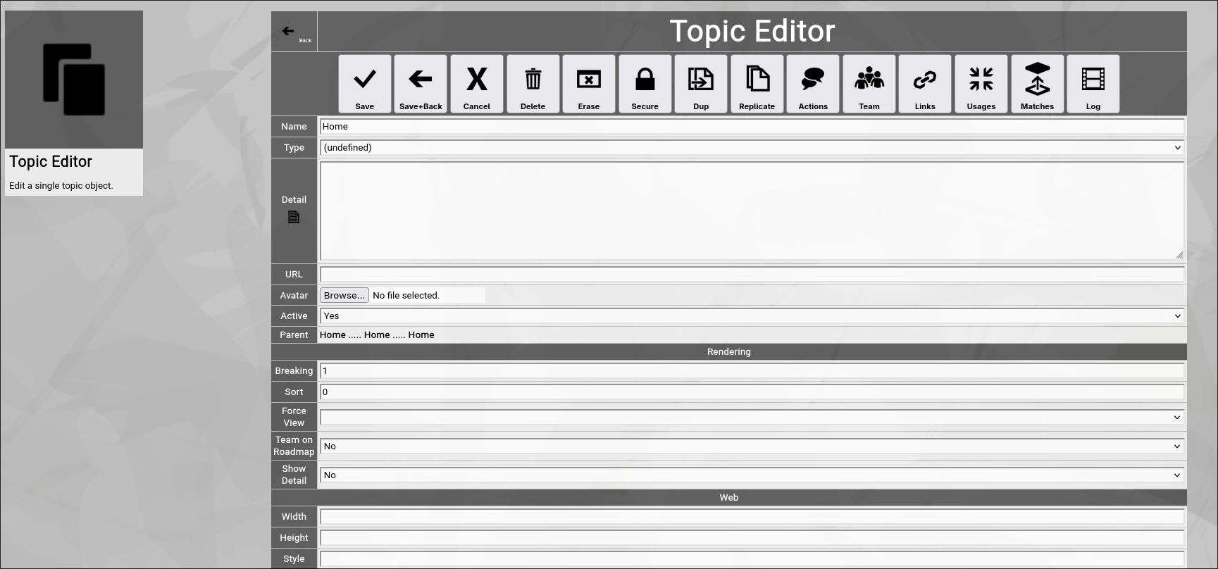
(Zingoolarity topic editor screen)
Wow, this is a lot of fields and options!
But luckily only a couple of them are relevant at the moment.
And again, luckily this screen is always the same whenever you edit a topic.
So once you understand it, you know the 80% of Zingoolarity which are most important.
And finally, all editor screens in Zingoolarity follow the same paradigm:
Grouped fields and functional buttons.
Now let us update two fields for the Home" topic:
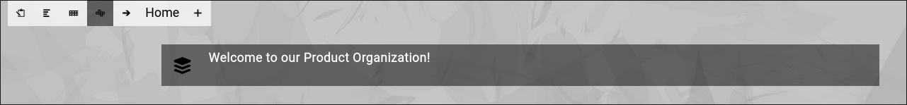
- We set the Detail field to the text "Welcome to our product organization!".
This text will be automatically shown on the top when the Home topic is in focus (like in the example shown before).
- We set the Breaking field to 3.
This indicates that all topics rendered below the Home topic will span over 3 columns and then spill over to the next row.
This is how we achieve the horizontal alignment pattern shown in the example before.
Now we click the Save+Back button.
This will save our changes and return to the previous screen:
(Zingoolarity "home" topic with already set detail field)
You see already, that the "Detail" which we entered is rendered to the screen. |
| Adding new Topics below the currently focused Topic |
|---|
Adding new Topics below the currently focused Topic
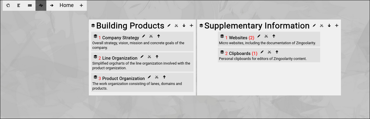
Now we will start entering the topics below the "Home" topic to achieve the state which was shown in the example above.
We click the "Add" button in the breadcrumb and we will see the same topic editor screen which we already encountered while editing the "Home" topic, this time showing a newly created topic.
Now we update one field again (and click the "Save+Back" button afterwards):
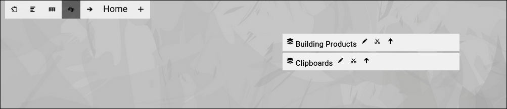
- We set the "Name" field to the text "Building Products".
Now you will see the following screen:
(Zingoolarity "home" topic with one topic added below)
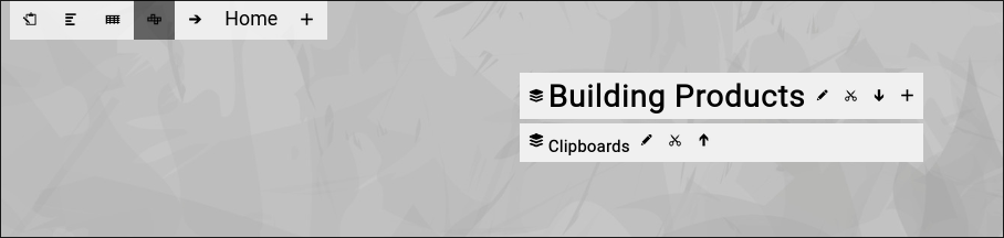
Next we click the "small arrow up" next to the new topic.
This will "open" the topic and will show its content directly in the future:
(Zingoolarity "home" topic with one opened topic added below)
The "small arrow up" has turned into a "small arrow down" and the name of the topic grew bigger (both signalling that the topic is now "open").
Next we click on the "Add" button next to the just opened item to add a new topic below this topic.
We update three fields again (and click the "Save+Back" button afterwards):
- We set the "Name" field to the text "Company Strategy".
- We set the "Detail" field to the text "Overall strategy, vision, mission and concrete goals of the company.".
- We set the "Show Detail" select box in the rendering section to "yes".
This indicates that we want to see the detail text on the map.
Now you will see the following screen:
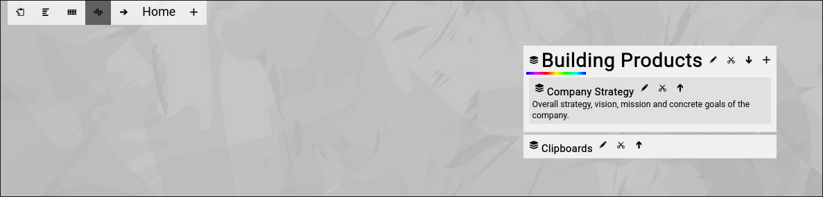
(Zingoolarity "home" topic with one topic added below)
You have just added the new topic below the "Building Products" topic.
By the way, notice the animated "rainbow bar" next to the topic you just edited.
This is an optical indicator of your "recent context" and allows you to easily focus again on where you left off.
This is especially important, if you are facing a large map (which has many topics on it and needs scrolling in the browser).
Note that your browser will also automatically scroll to the topic with the rainbow bar, if your map is larger than your screen and needs scrolling.
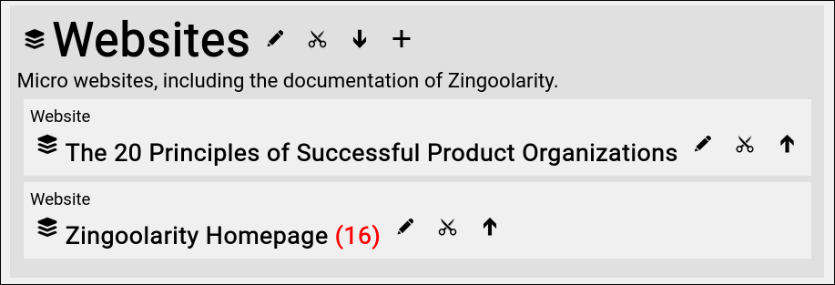
Now have a look again at our example from the beginning:
(Zingoolarity example "home" topic)
Try to add the missing topics topic-by-topic on your own.
This will finally create the state which we used as an example.
Congratulations!
You now already know the basics of adding topics to your contextchart. |
| Looking at One Single Topic |
|---|
Looking at One Single Topic
Next, let us have a look at one single topic, which is shown on the map:
(One Zingoolarity topic rendered on the map)
You see a "card stack" icon (or "yellow sticky” icon, depending on the iconset selected) left of the name of your topic.
This is the generic icon for a topic.
If your topic contains an attachment which is a picture (in .jpg, .png or .gif format), the attached picture will be rendered instead as a small icon.
To the right of the name you see 3 clickable buttons:
- The "Edit” button.
Clicking this will invoke the "Edit" screen as already explained above.
- The "Cut” button.
Clicking this allows you to cut the topic to your personal clipboard.
More details will be explained further down in this getting started guide.
Note that this button is only visible if you have "Write” access to the topic.
- The "Open” / "Close” button.
The "arrow up” icon indicates, that the topic is currently closed.
If you click this button, it will change to the "arrow down” icon (which means that the topic is currently opened) and the topics below this topic (if any) are also rendered.
Clicking the button again will return to the "closed” state.
Note that this button is only visible if you have "Write” access to the topic.
If a topic is closed and topics exist below this topic, the number of topics is rendered in red next to the topic name.
(One Zingoolarity topic on the map in "closed” state with 2 topics below)
If you now click on the blue arrow, the screen will change to something like this:
(One Zingoolarity topic on the map in "opened” state with 2 topics below)
The font size of the opened topic is much bigger now.
And the contained topics are rendered below.
This behavior actually works anywhere on the map and multiple levels deep.
You will also notice that an additional "Add” button appears next to the opened topic.
This allows you to directly add new topics below without focusing on the topic first. |
| Editing a Topic |
|---|
Editing a Topic
Let us have a look again at the topic editor screen and explain all the available fields in detail.
Remember that this screen is invoked by clicking the "Edit” button next to a topic or when adding a new topic:
(Zingoolarity topic editor screen)
Let us explain all the available fields:
GENERAL fields
General fields deal with the general attributes of a topic and are always useful in some way.
- Name
The "Name” of a topic represents its easy-to-understand name.
It is always shown in the different views in Zingoolarity.
- Type
The optional "Type” of a topic can further specify of which kind the topic is.
If you select a type, the view of a topic will change to the following (You will notice the type on top):

(One Zingoolarity topic on the map with the type set to "Company”)
- Detail
The optional "Detail” of a topic is a full text description, optionally formatted in HTML.
This allows you to store formatted text inside of the topic.
If you use HTML sparsely and feel up to it, you can enter HTML tags directly (e.g. if you want to underline something in the text, you can include it in tags).
If you want to do more sophisticated stuff, you can activate the embedded HTML WYSIWYG editor by setting the option "Use HTML Editor” in the "Settings” screen (upper-right corner of the screen) to "On”.
If you want to have more screen space before editing your topic, you can click on the "Detail” label (this makes only sense if you are not using the HTML editor, because the HTML editor has its own "full screen” option available).
- Keyword
The optional "Keyword" is a short phrase, which represents a secondary key for pages in websites.
It is used internally by the help subsystem of Zingoolarity.
- URL
The optional "URL” of a topic allows you to enter or paste a link to an external application or document.
When you focus on the topic, the URL will be shown below the "Detail” in a separate box.
- Avatar
The optional "Avatar” allows you to upload a binary attachment to the topic.
You have to click on the "Browse” button to select a file from a local directory.
If you upload a file ending with either ".jpg”, ".png” or ".gif”, it will be identified as a picture and also rendered as a topic icon in the different views.
If not (if it is for example a document for an application), it can be downloaded for viewing or editing.
- Active
By default, a new topic is active.
If you set a topic to inactive, it will be rendered in "stroke out” format in the different views.
Setting a topic to inactive can be used as some kind of "soft delete”.
- Parent
This field is not directly editable and shows up to 3 levels of topics above the currently edited topic.
To move a topic to another parent, you can either use the cut&paste approach explained further down in this getting started guide or you can click on the "Parent” label to view and navigate the breadcrumb above the currently edited topic and click on the "Target” button next to a topic to assign it as the new parent (clicking the "Cancel” button will return to the "Edit” screen without any changes).
RENDERING fields
Rendering fields influence the rendering of the topic in the different views.
- Breaking
The "Breaking” of a topic allows you to specify the number of columns after which a new row will be started, when topics inside of this topic are rendered.
The default is 1 (which means that topics inside of this topic will be aligned vertically).
We have used this field already in the "Configuring the Home Topic” chapter.
- Sort
The "Sort” of a topic specifies an optional additional numeric sort criteria for this topic.
The default is 0.
If you specify for example 1, this topic will be sorted after all other topics which still have 0.
This allows you to influence the sort order and force topics either to the beginning or the end of a list.
- Force View
The "Force View” of a topic optionally switches to a specified view if the topic is focused.
Under normal conditions, the different view modes can be toggled by clicking the different view buttons in the breadcrumb.
But if you want to explicitly build a roadmap (assembling the topics below on a timeline), you can force for example the "Roadmap” view on the topic which represents the roadmap.
- Team on Roadmap
The "Team on Roadmap” of a topic specifies whether a team which you have added to the topic will be rendered in the different views or not.
If for example you want to create an organizational chart, you set this to "Yes” in each topic representing an organisational unit, a department or a team.
For more information on "Teams” see further down in this getting started guide.
- Show Detail
The "Show Detail” of a topic specifies whether the "Detail” of a topic will be rendered in the different views or not.
By default the "Detail” of a topic are only rendered, when the topic is focused.
WEB
Web fields are only used by the already mentioned 4th view in Zingoolarity: the "Web”.
- Width
The optional "Width” of a topic defines a value of pixels (e.g. "128px”) or a value in percent (e.g. "30%”) to optionally specify the width of a topic when rendered as web content.
The default width is "15%”.
- Height
The optional "Height” of a topic defines a value of pixels (e.g. "256px”) to optionally specify the height of a topic when rendered as web content.
The default height is "128px”.
- Style
The optional "Style” of a topic allows you to directly enter style attributes for the topic when rendered as web content.
If you for example enter "background-color:#ff8080;color:#ffffff;” here, the topic will be rendered with a white font on a red background.
- Avatar
The alternative "Avatar" of a topic allows you to enter an image URL which will be rendered in the web view.
This is similar to the behavior of an avatar attachment, but it is "by reference" without uploading any data.
When designing micro websites in Zingoolarity, this is helpful if you deal with large binary data (e.g. movies), which you do not want to include in the database.
- Force New Row
The optional "Force New Row” of a topic defines whether a new row will begin after this topic when rendered as web content.
BUDGETING
Budgeting fields can be used to add an optional financial budget to a topic.
- Budget
The "Budget” of a topic consists of a predefined arrangement of fields depending on the "Periods” available in your Zingoolarity instance.
The most common setup will show the 12 months of the current year in the first row and the 12 months of the next year in the second row.
But this can be configured to a completely differently setup by editing the "Periods” in your instance.
By default, the budget is 0 for each and every months (which means "non-existent”).
As soon as you enter an amount in at least one month, the topic will have an active budget and all the periods and their amounts will be rendered in the different views inside of the topic.
The views will automatically aggregate totals, if appropriate for the view mode.
Other topics can now become "Invoices” (representing spent amounts of money), which can be matched to the topics with a budget.
Matching is explained further down in this getting started guide.
TOPIC TIMING
Topic timing fields optionally specify a timing for the topic.
- Timing
The "Timing” of a topic is selectable from the predefined timings available in your Zingoolarity instance.
A timing in the context of a roadmap is not a fixed date, but a slot on the timeline of variable length.
This is usually either a month inside of a year (for monthly granularity) or a calendar week inside of a year (for weekly granularity).
But you can add for example your own sprint cycles with 2 weeks each, if your setup requires this.
As an example, you would assign a topic to "2024-08 August”.
- Duration
The "Duration” of a topic specifies, how many cycles of the selected timing are used.
If we stick to the example of the "2024-08 August” timing above, you could for example select "2 units” to signal that your topic will be executed in August and September.
If you select a timing and do not select a duration, Zingoolarity assumes "1 unit”.
- End
The "End” of a topic is a calculated valued based on the previously entered timing and the previously entered duration.
In the above example of the timing of "2024-08 August” and the duration of "2 units”, the calculated end would be "2024-09 September”.
TOPIC STATE
Topic state fields optionally specify information about who is responsible for a topic and in which execution state the topic currently is.
- Owner
The optional "Owner” of a topic specifies the user who owns the topic and is responsible for it.
- State
The optional "State” of a topic specifies the state in which the topic currently is.
States are predefined for your Zingoolarity instance.
For more details about the default states, see "Using the States Browser” near the end of this getting started guide.
- Percent
The optional "Percent” of a topic specifies an estimate, to which degree a topic has already been completed.
The default is "-1%”, which means "not started”.
Any other value will make a percentage bar appear when rendering the topic in one of the available views.
As this is an estimate, percentages are available in steps of 10%.
Note that some states have percentages associated.
If you for example set the state to "Done”, the percentage will be automatically set to "100%”.
This behavior can be configured in the state browser.
SUBTOPICS TIMELINE
Subtopic timeline fields optionally specify the starting point and the number of available slots, if this topic is used as a roadmap itself.
Thereby it also specifies implicitly the granularity of the timeslots.
- Timeline
The "Timeline” of a topic is selectable from the predefined timings available in your Zingoolarity instance.
A timeline in the context of a roadmap is not a fixed date, but a slot of variable length.
This is usually either a month inside of a year (for monthly granularity) or a calendar week inside of a year (for weekly granularity).
But you can add for example your own sprint cycles with 2 weeks each, if your setup requires this.
As an example, you would assign a topic to "2024-08 August”.
- Span
The "Span” of a topic specifies, how many cycles of the selected timeline are used.
If we stick to the example of the "2024-08 August” timing above, you could for example select "2 units” to signal that your topic will span August and September as a roadmap.
If you select a timeline and do not select a duration, Zingoolarity assumes "1 unit”.
- End
Again, the "End” of a topic timeline is a calculated valued based on the previously entered timeline and the previously entered span.
In the above example of the timeline of "2024-08 August” and the span of "2 units”, the calculated end would be "2024-09 September”.
ACCESS
Access fields specify who can access the topic at which access level.
For more details about access security, see the chapter about "Securing a Topic” further down in this getting started guide.
- Owner
The access "Owner” of a topic is usually the person who created the topic.
By default, the access owner always has full access to the topic.
- Locks
The optional "Locks” of a topic specify, which keys grant which access level to the topic.
By default (if no locks are set), only access by the owner of the topic is possible. |
| Saving a Topic |
|---|
Saving a Topic
In essence, we already explained this during the configuration of the "Home” topic.
But let us sum it up, so that you are aware of the 3 relevant buttons involved, which are located left-most just below the input fields of the topic editor screen:
- Save button
The "Save” button saves all the changes you made to the database.
It will stay in the topic editor screen afterwards, so that you can continue editing.
- Save+Back button
The "Save+Back” button will do exactly the same as the "Save” button, but will return affterwards to the screen from which you invoked the editor.
In appropriate cases, the so-called "rainbow bar” will indicate the topic on the map which you edited, so that you are quickly "in context” again.
- Cancel button
The "Cancel” button will not save anything and directly return to the screen from which you invoked the editor.
Again, in appropriate cases, the so-called "rainbow bar” will indicate the topic on the map which you edited, so that you are quickly "in context” again.
|
| Deleting+Erasing a Topic |
|---|
Deleting+Erasing a Topic
You have two options to get rid of a topic again:
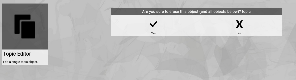
Inside of the topic editor screen, use either the "Delete” or the "Erase” button.
- Click the "Delete” button
The delete function tries to delete the current topic only.
If there are topics below the topic, the delete option will fail and nothing will happen.
This should be your default way of trying to delete a topic.
If it fails, you can consider whether you really want to delete the entire topic tree by using the "Erase” function instead.
- Click the "Erase” button
The erase function tries to delete the current topic and all topics down below in a tree-like fashion.
Use this function if you want to delete an entire structure of topics (e.g. a roadmap and all its items).
Both functions require you to confirm the operation before it is executed:
(Confirmation dialog of the Zingoolarity erase screen)
|
| Securing a Topic |
|---|
Securing a Topic
We already shortly touched the "Owner” and the "Locks” fields in the chapter about "Editing a Topic”.
These two fields together govern the access to the individual topic.
User Keys
Every user in Zingoolarity can possess a number of so-called "keys”.
Every key is a unique word.
The key field of a user record can contain a space-delimited list of 1..N keys.
Keys of a user can only be maintained by administrators of the Zingoolarity instance.
A valid example for a list of user keys may be for example:
all trinity
Topic Locks
Every topic has an "owner” field.
This field is initialized when the topic is newly created and is automatically set to the user who created the topic.
Every topic also has a "locks” field.
This field can hold a space-delimited list of combinations of a key and an access level, again delimited by a dot.
A valid example for a list of topic locks may be for example:
all.r trinity.w nightworx.a
General Access Rules
The owner of a topic always has full access to the topic.
Administrative users always have full access to all topics in the Zingoolarity instance.
Users with a key in their key list, which also appears in the lock list of a topic, have access to the topic at the specified level after the dot.
If a topic has an empty list of locks, only the owner of the topic and the administrators have (full) access to the topic.
If a user has an empty list of keys, the user has only access to his or her own topics (except he or she is an administrator).
Access Levels
The following hierarchical access levels are available:
| .r | Read | Topic can be read. |
| .a | Add | Topics below the topic can be added. |
| .w | Write | Topic can be written. |
| .s | Super | Full access to the topic (same as the owner of the topic). |
Securing Topics below the Current Topic
By default, access security can be set by editing the "Locks” field of a topic.
This field can only be edited, if you own the topic or you have ".s” (super) level access to the topic.
Furthermore, it only affects one single topic (the one which you are currently editing).
If you want to apply the security setting to all topics below the current one, you can click the "Secure” button.
This will copy the "Owner” field and the "Locks” field to all topics below.
Note that this will only work, if you are the owner (or have ".s” (super) access) to all the topics below.
This is for example helpful, if you have a roadmap containing multiple levels of topics representing the activities and milestones and you want to make sure that there is a uniform access security setting to all information available in the roadmap.
Much like the "Delete” function, the "Secure” function requires you to confirm the operation before it is executed:
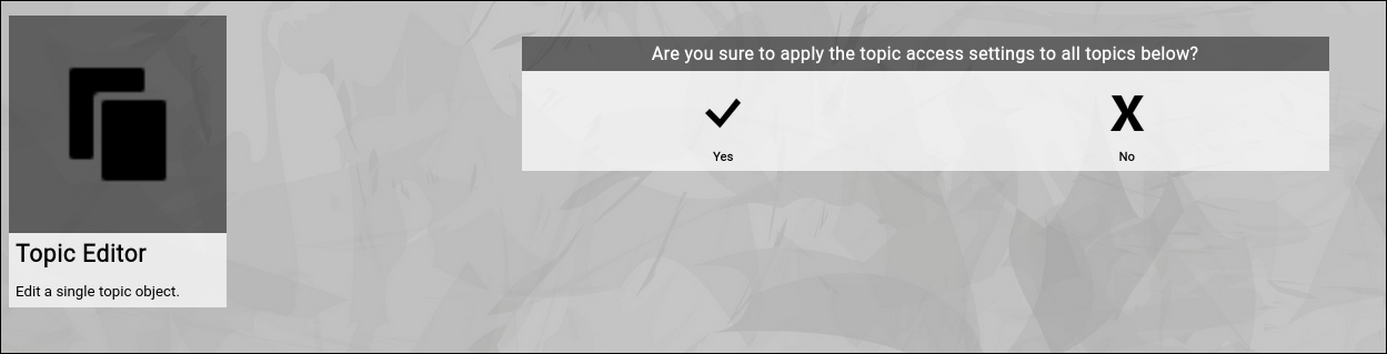
(Confirmation dialog of the Zingoolarity secure screen)
|
| Duplicating+Replicating a Topic |
|---|
Duplicating+Replicating a Topic
Sometimes there is a need to duplicate a topic (much like a template), to use most of the field values as defaults and only change one or two fields of the copied topic afterwards.
You have two options to copy a topic:
Inside of the topic editor screen, use either the "Dup” or the "Replicate” button.
- Click the "Dup” button
The dup function tries to duplicate the current topic only.
To be able to duplicate a topic, you need ".w” (write) level access to it.
- Click the "Replicate” button
The replicate function tries to duplicate the current topic and all topics down below in a tree-like fashion.
Use this function if you want to duplicate an entire structure of topics (e.g. a roadmap and all its items).
Again, to be able to replicate a topic, you need ".w” (write) level access to it and all topics below.
Both functions require you to confirm the operation before it is executed:
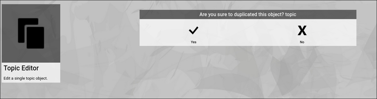
(Confirmation dialog of the Zingoolarity dup screen)
The new topic will be placed at the same parent topic, so it should be easy to find after you exit the editor screen and return to the previously shown map.
To move it somewhere else afterwards is easy by using the "Cut" and "Paste" functionality (explained later in this getting started guide). |
| Working with Topic Actions |
|---|
Working with Topic Actions
As already explained before, topics can represent nearly any kind of "thing” inside of Zingoolarity.
They can be folders, orgcharts, units, teams, roadmaps, themes, epics, stories and much more.
The "Actions” functionality allows you to maintain an activity log associated with any of these things.
An "action” in this sense is anything you have done in the context of the topic, which is noteworthy enough, relevant for other people and which needs documentation.
Actions have an author, a place on the timeline and a detailed text content, which essentially boils down to the classic scheme of who, when and what.
You can switch to the actions associated with a topic by clicking the "Actions” button inside of the topic editor screen.
Initially the screen will be empty and will look something like this:
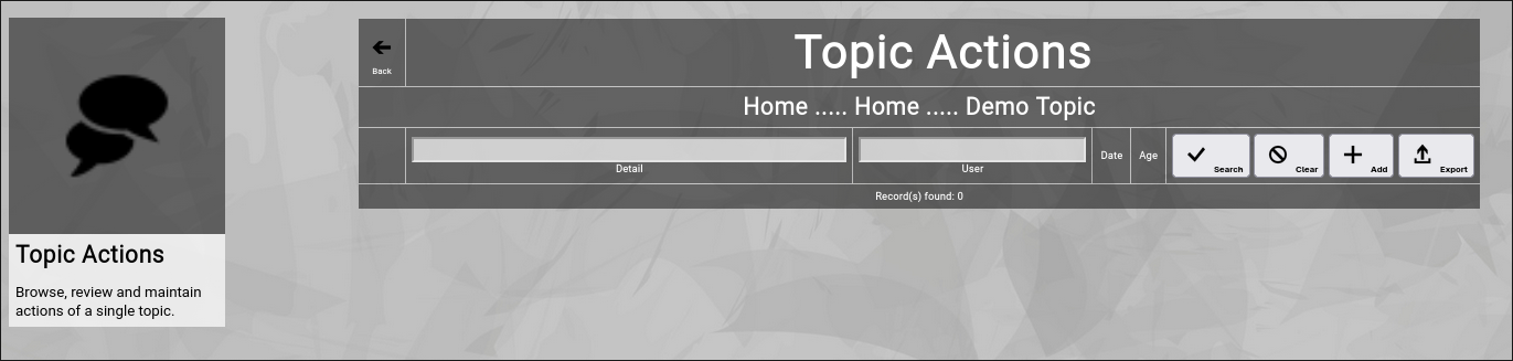
(Zingoolarity topic actions screen)
You can now click the "Add” button to add a new action to the topic.
It will switch to the action editor screen:
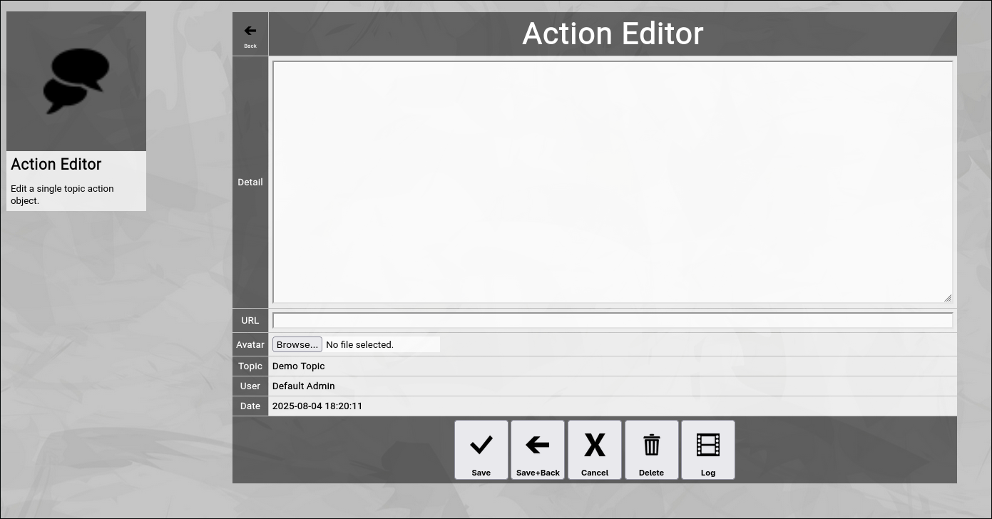
(Zingoolarity action editor screen)
Let us have a quick look at the available fields:
- Detail
The "Detail” of an action contains a textual description of the action which has been taken.
Much like the "Detail” of a topic it can manually contain HTML tags (like the "
” tag in the example above to force a line break) or it can be edited with the integrated HTML editor (if it is activated in the "Settings” screen).
- URL
The optional "URL” of an action allows you to enter or paste a link to an external application or document.
In the list of actions, the URL will be shown below the "Detail”.
- Avatar
The optional "Avatar” allows you to upload a binary attachment to the action.
You have to click on the "Browse” button to select a file from a local directory.
If you upload a file ending with either ".jpg”, ".png” or ".gif”, it will be identified as a picture and also rendered as an action icon in the different views.
If not, it can be downloaded for viewing or editing.
Much like in the topic editor screen, you have a selection of buttons to complete your input:
- The "Save” button will just save your action (without leaving the action editor screen).
- The "Save+Back” button will do the same but return to the previous screen.
- The "Cancel” button will just return to the previous screen (without saving).
- The "Delete” button will request confirmation, will delete the action and then will return to the previous screen.
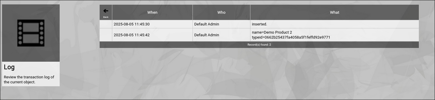
- The "Log” button will show a historical transaction log of the current action (for auditing purposes).
When you return to the previous screen, you will see the action which you just added in the list of actions:
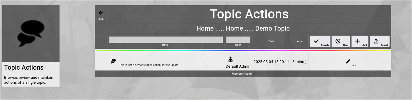
(Zingoolarity topic actions screen with a recently added action)
And you will also see the "rainbow bar” again, marking the action which you just edited.
This is helpful if there are already many actions for the given topic.
The screen will scroll to the last edited action and will highlight it with the "rainbow bar”.
Editing an existing Action
You will also see the "Edit” button next to each and every action.
Clicking this button will allow you to switch to the action editor screen again to make some modifications.
Filtering the Topic Actions
In general, the newest actions are always rendered on top (they are sorted by date in descending order).
If you already have many actions added, it might be helpful to additionally filter.
You can enter:
- Part of a "Detail”
to search for a keyword in the details of the action.
- Part of a "Username”
to search for actions of a given user only.
You may click on the "Search” button to perform the filtering or click the "Clear” button to remove a currently active filter again.
Going Back to the Topic
You can click the "Back” button in the upper-left corner to return to the previous screen (in this case, the topic editor screen). |
| Building Teams |
|---|
Building Teams
Zingoolarity allows you to build teams around topics.
What exactly is meant by that depends mostly on what a topic represents:
- If a topic is for example a "project”, the team is essentially the project team.
- If a topic is for example a "product”, the team is essentially the product team.
- If a topic is for example a "unit” in the line organization, it can be a department with a department head.
- If a topic is for example an "epic”, your "team” might only consist of one responsible person who cares for the completion of the epic.
- ...
As all of this is dynamic (a topic can simply have a number of people associated with it), you can easily come up with other ideas.
The relationship of users with a topic forming a team has an additional number of important attributes, which will be explained further down.
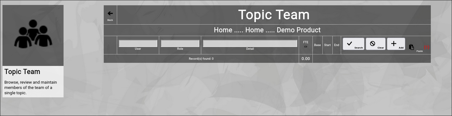
You can switch to the team associated with a topic by clicking the "Team” button inside of the topic editor screen.
Initially the screen will be empty and will look something like this:
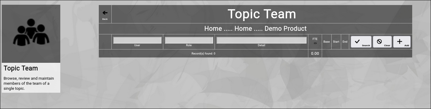
(Zingoolarity topic team screen)
You can now click the "Add” button to add a new team member to the topic.
It will switch to the team editor screen:
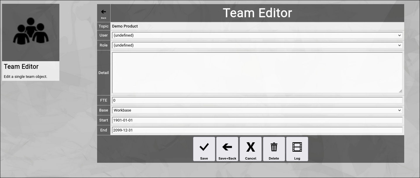
(Zingoolarity topic team screen)
Let us have a quick look at the available fields:
- User
The "User” in a team represents a person selected from the listed users of the Zingoolarity instance.
It can be selected from an alphabetically sorted drop-down list.
- Role
The "Role” in a team represents the official role which the user takes over in the context of the team.
Roles come from a predefined list established in your Zingoolarity instance (See "Using the Roles Browser” chapter further down in this getting started guide for more details how to maintain this list).
It can be selected from an alphabetically sorted drop-down list.
- Detail
The "Detail” of a team member contains an optional textual description of the team membership (if needed).
Much like the "Detail” of a topic it can manually contain HTML tags (like the "
” tag in the example above to force a line break).
- FTE
The "FTE” (Full Time Equivalent) of a team member defines, how much of the available time the new team member will spend on the role in the context of the team.
The "1” is defined as "fulltime”, the "0.4” for example means "two days a week” and the "0.5” for example means "halftime”.
If your topic represents a unit in a line organization, this is the overall available workforce of the person; if your topic represents an item of the work organization (e.g. a product team), this is the part of the overall workforce which will be spent on the topic.
If your topic just represents a "responsibility” (for example Rose Tyler is making sure that the epic will be completed), you can leave the default of "0” (as it is not a fixed time assignment).
- Base
The "Base” of a team member can be either "Homebase” or "Workbase”.
The "Homebase” option designates that the assignment is a line organization (making resources available).
The "Workbase” option designates that the assignment is a work organization (consuming resources).
As a rule of thumb, you should use "Homebase” when assigning users to your company orgchart and should use "Workbase” when defining working structures (projects, products, etc).
- Start and End
The optional "Start” and "End” of a team member can limit the membership to a certain starting date (for example if the user is a new recruitment or is changing assignment by the end of the month) or to a certain ending date (if the user will switch to a different assignment or will leave the company).
Much like in the topic editor screen, you have a selection of buttons to complete your input:
- The "Save” button will just save your team membership (without leaving the team editor screen).
- The "Save+Back” button will do the same but return to the previous screen.
- The "Cancel” button will just return to the previous screen (without saving).
- The "Delete” button will request confirmation, will delete the team membership and then will return to the previous screen.
- The "Log” button will show a historical transaction log of the current team membership (for auditing purposes).
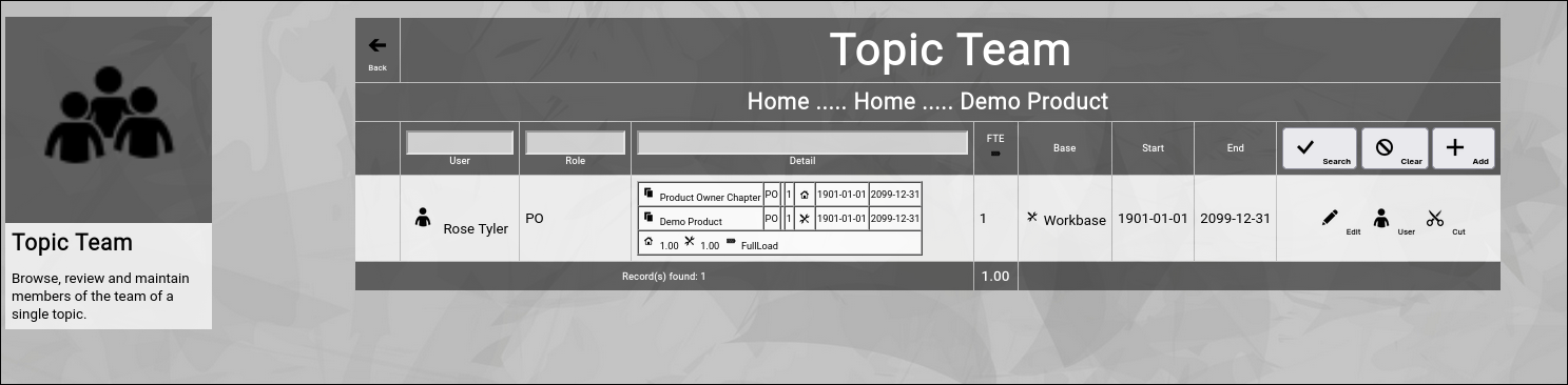
When you return to the previous screen, you will see the team membership which you just added in the list of the team:
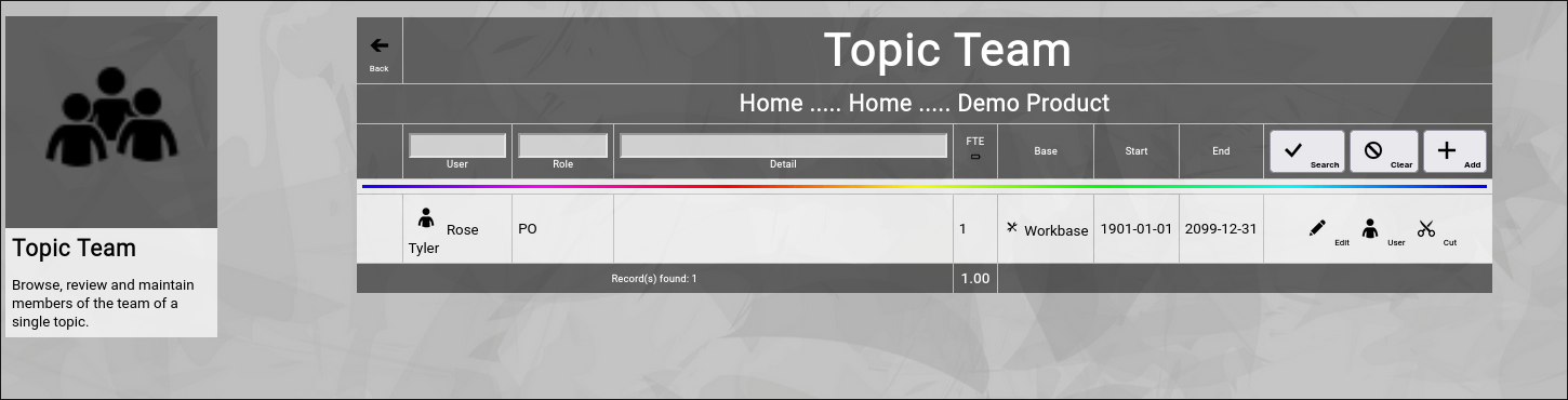
(Zingoolarity topic team screen with a recently added team member)
And you will also see the "rainbow bar” again, marking the team membership which you just edited.
This is helpful if there are already many team members for the given topic.
The screen will scroll to the last edited team membership and will highlight it with the "rainbow bar”.
Editing an existing Team Membership
You will also see the "Edit” button next to each and every user in the team.
Clicking this button will allow you to switch to the team editor screen again to make some modifications.
Viewing or Editing a User
Sometimes it may be necessary to view the user or make some changes in the user, which you added to the team.
You can click on the "User” button next to the team member to invoke the user editor screen for it.
Note that editing will only be possible if you are an administrator.
Cutting and Pasting Users between Teams
Sometimes it makes sense to move a bunch of users from one team to another team.
This can be accomplished by the use of the clipboard.
You may have noticed the "Cut” button next to a team member.
This function is only available if you have ".w” (write) level access to the topic.
If you click this button, the team membership record will be moved to your personal clipboard.
As soon as there is a team membership in your personal clipboard, the "Paste” button will show up in the team editor screen:
(Optional paste button in the Zingoolarity topic team screen)
In RED, it will also show the number of team memberships currently in your personal clipboard.
You may now navigate to the team editor screen of another topic and click the "Paste” button to paste the team memberships there.
Filtering the Topic Team
In general, the team members are sorted by the predefined order of their role and inside of their role in alphabetic order.
If you already have many team members added, it might be helpful to additionally filter.
You can enter:
- Part of a "Username”
to search for a given team member only.
- Part of a "Rolename”
to search for a certain role only.
- Part of a "Detail”
to search for a keyword in the details of the team membership.
You may click on the "Search” button to perform the filtering or click the "Clear” button to remove a currently active filter again.
Checking the Load of Team Members
If you are assembling a team for a project, a product or another more permanent role, it might be helpful to check the load of the team members.
To toggle this view, click on the small "Battery” button in the headline of the FTE column.
This will activate (or deactivate again) the individual resource assignment view of all the team members.
Here is an example:
(Zingoolarity topic team screen with activated load option)
Let us focus on the new table inside of the "Detail” column:
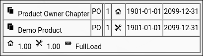
(Optional load option in the Zingoolarity topic team screen)
This lists all the assignments of a user (including the current one) and calculates a total load by separately adding up "Homebase” and "Workbase” assignments and finally comparing both numbers to each other.
In the current example, Rose has a work assignment and a line assignment with 1 FTE, so totals are calculated correctly and the result is "FullLoad" (can be "NoLoad”, "PartialLoad” or "FullLoad”).
Going Back to the Topic
You can click the "Back” button in the upper-left corner to return to the previous screen (in this case, the topic editor screen). |
| Creating Dependencies with Links |
|---|
Creating Dependencies with Links
Zingoolarity allows you to build links between topics.
Again, this can represent many things, depending on what the involved topics represent:
- It can be a dependency between "epics” in different "products”.
- It can be a contextual relationship between different maps (for example the implementation of business capabilities by a product).
- ...
As all of this is dynamic (a topic can simply have a number of links to other topics), you can easily come up with other ideas.
You can switch to the links associated with a topic by clicking the "Links” button inside of the topic editor screen.
Initially the screen will be empty and will look something like this:
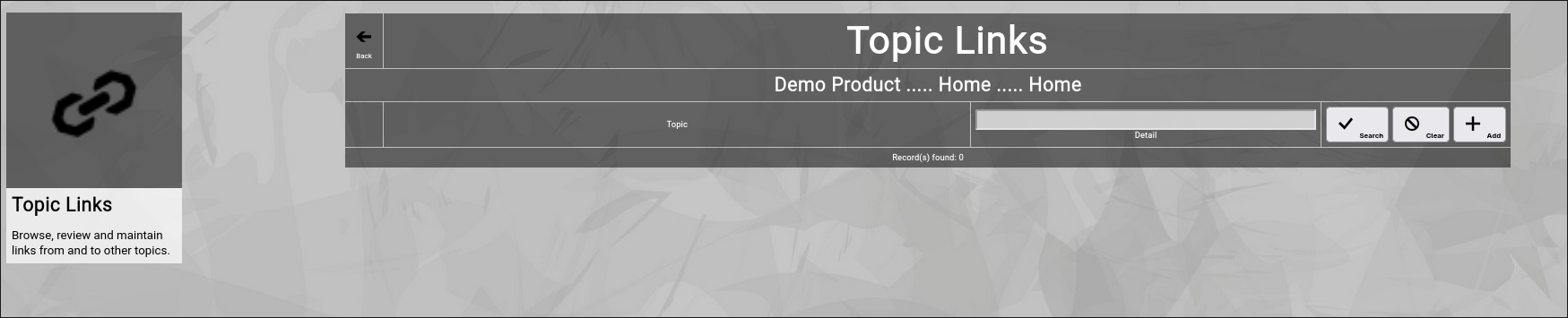
(Zingoolarity topic links screen)
You can now click the "Add” button to add a new link to the topic.
It will switch to the link editor screen:
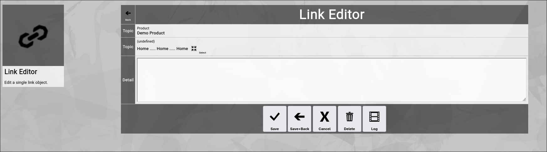
(Zingoolarity link editor screen)
Let us have a quick look at the available fields:
- Topic
There are two topic fields:
The one from which the link originates and the one to which the link points.
The 2nd topic has a "Select” button next to it.
This allows you to select the target topic of the link (which is explained further down).
- Detail
The "Detail” of a link optionally further explains what the link is all about.
Much like the "Detail” of a topic it can manually contain HTML tags (for example a "
” tag to force a line break).
Much like in the topic editor screen, you have a selection of buttons to complete your input:
- The "Save” button will just save your link (without leaving the link editor screen).
- The "Save+Back” button will do the same but return to the previous screen.
- The "Cancel” button will just return to the previous screen (without saving).
- The "Delete” button will request confirmation, will delete the link and then will return to the previous screen.
- The "Log” button will show a historical transaction log of the current link (for auditing purposes).
Selecting the Target of a Link
Zingoolarity can be configured to show a drop-down box to simply select the target topic of a link "in one go”.
This only makes sense in small Zingoolarity instances, as your topics soon get into the hundreds and thousands, so a simple drop-down box is not practical.
Therefore by default, you have to click on the "Select” button to select a target topic.
This will show the following screen:

(Zingoolarity link target selection breadcrumb)
You basically see a breadcrumb to your current topic here.
You can now do multiple things:
- Click the "Cancel” button
This will abort the selection process and return to the previous screen.
- Click on one of the names of the topics above
This will navigate to the selected topic, for example click on "Demo Domain":
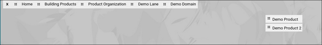
(Zingoolarity link target selection breadcrumb with two topics available)
You will now see the topics included in the "Demo Domain” topic.
- Click the "Select” button next to a topic
This will finally select the target topic and return to the previous screen.
For example clicking on "Demo Product 2” will result in this:
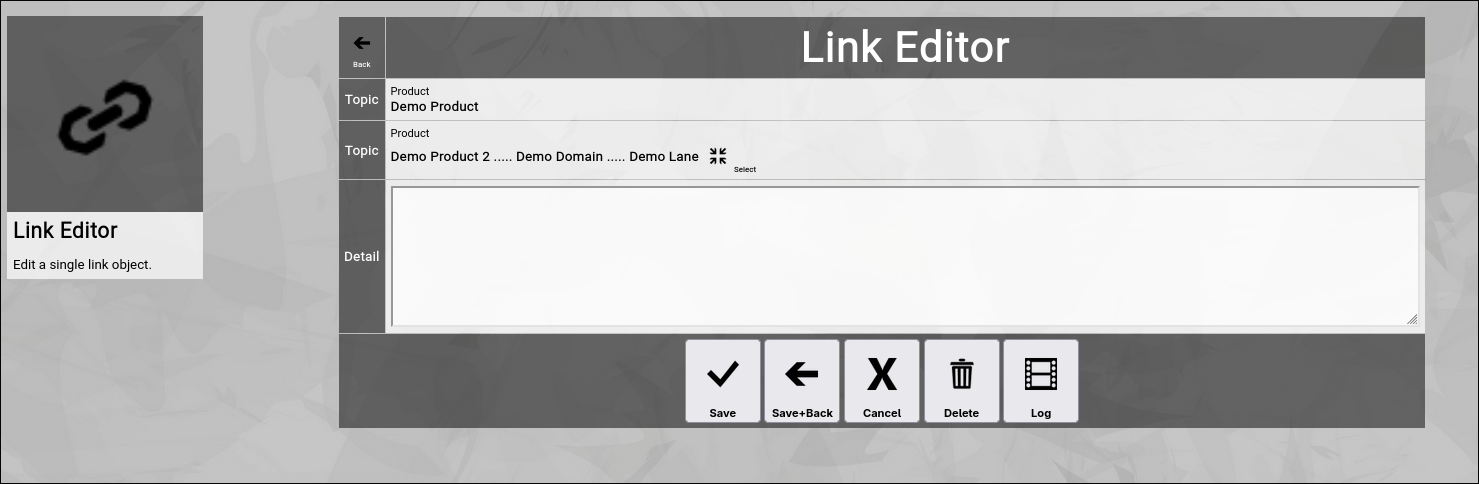
(Zingoolarity link editor screen with selected example target topic)
You can now modify the "Detail” field to your liking and click the "Save+Back” button or simply click the "Cancel” button, if you do not want to add anything in this screen.
The screen will return to the previous screen.
When you return to the previous screen, you will see the link which you just added in the list of the links:
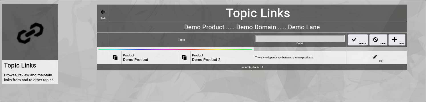
(Zingoolarity topic link screen with a recently added linked topic)
And you will also see the "rainbow bar” again, marking the link which you just edited.
This is helpful if there are already many links for the given topic.
The screen will scroll to the last edited link and will highlight it with the "rainbow bar”.
Editing an existing Link
You will also see the "Edit” button next to each and every link.
Clicking this button will allow you to switch to the link editor screen again to make some modifications.
Filtering the Topic Link
In general, the links are sorted in alphabetic order of the target topic.
If you already have many links added, it might be helpful to additionally filter.
You can enter:
- Part of a "Detail”
to search for a keyword in the details of the link.
You may click on the "Search” button to perform the filtering or click the "Clear” button to remove a currently active filter again.
Going Back to the Topic
You can click the "Back” button in the upper-left corner to return to the previous screen (in this case, the topic editor screen). |
| Maintaining the Usage of Applications for Capabilities |
|---|
Maintaining the Usage of Applications for Capabilities
Zingoolarity allows you to build intersections between business capabilities, technical applications and products.
This allows you to plot the current architectural picture and incrementally the target architectural picture.
Topics represent parts of our product map (lanes, domains and products / product teams), which take responsibility for the respective applications.
You can switch to the usages associated with a topic by clicking the "Usages” button inside of the topic editor screen.
Initially the screen will be empty and will look something like this:
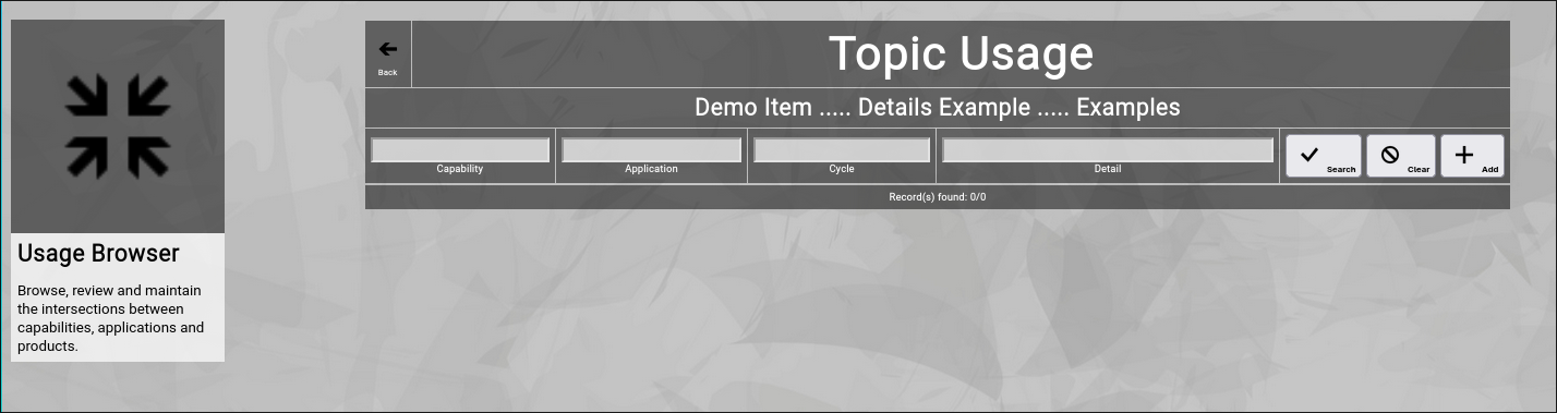
(Zingoolarity topic links screen)
You can now click the "Add” button to add a new usage to the topic.
It will switch to the usage editor screen:
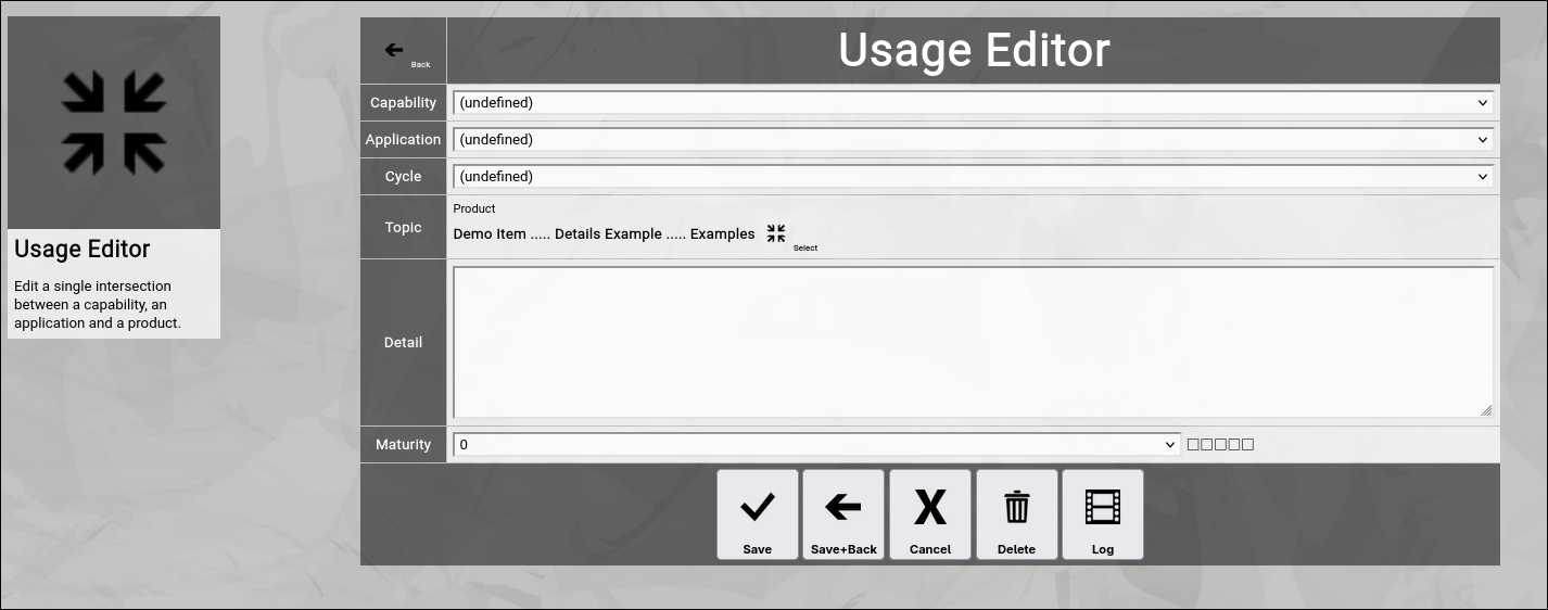
(Zingoolarity usage editor screen)
Let us have a quick look at the available fields:
- Capability
The "Capability" represents the implemented business capability.
It can be selected from a structured list of lane, domain and capability (which represents the official business domain map).
- Application
The "Application" represents the technical building block, which implements the capability.
IT can be selected from an alphabetically sorted list of applications.
- Cycle
The "Cycle" represents the lifecycle state, in which the application implementing the capability currently is.
It ranges from "Target" (target application to be implemented) to "Decommissioned" (no longer used).
- Topic
The "Topic" represents either a lane, domain or (under normal circumstances) a product, which you can select from your product map.
This is implicitly set, as you are in the context of a topic already.
But you can also start the selection process by clicking on the "Select" button.
You will face a breadcrumb, which allows you to navigate topicspace and select the correct item.
- Detail
The "Detail” of a usage optionally further explains what the usage is all about.
Much like the "Detail” of a topic it can manually contain HTML tags (for example a "
” tag to force a line break).
- Maturity
The "Maturity" represents a five star rating, what maturiy level is currently associated with a business capability implemented by an application or what the target maturity level of a to-be-introduced application is expected.
This is helpful for communication purposes about your target architecture landscape.
Much like in the topic editor screen, you have a selection of buttons to complete your input:
- The "Save” button will just save your usage (without leaving the usage editor screen).
- The "Save+Back” button will do the same but return to the previous screen.
- The "Cancel” button will just return to the previous screen (without saving).
- The "Delete” button will request confirmation, will delete the usage and then will return to the previous screen.
- The "Log” button will show a historical transaction log of the current usage (for auditing purposes).
Selecting another Topic of a Usage
Zingoolarity can be configured to show a drop-down box to simply select the topic of a usage "in one go”.
This only makes sense in small Zingoolarity instances, as your topics soon get into the hundreds and thousands, so a simple drop-down box is not practical.
Therefore by default, you have to click on the "Select” button to select a topic.
This will show the following screen:
(Zingoolarity topic selection breadcrumb)
You basically see a breadcrumb to your current topic here.
You can now do multiple things:
- Click the "Cancel” button
This will abort the selection process and return to the previous screen.
- Click on one of the names of the topics above
This will navigate to the selected topic, for example click on "Demo Domain":
(Zingoolarity topic selection breadcrumb with two topics available)
You will now see the topics included in the "Demo Domain” topic.
- Click the "Select” button next to a topic
This will finally select the topic and return to the previous screen.
You can now modify the "Detail” field to your liking and click the "Save+Back” button or simply click the "Cancel” button, if you do not want to add anything in this screen.
The screen will return to the previous screen.
When you return to the previous screen, you will see the usage which you just added in the list of the usages:
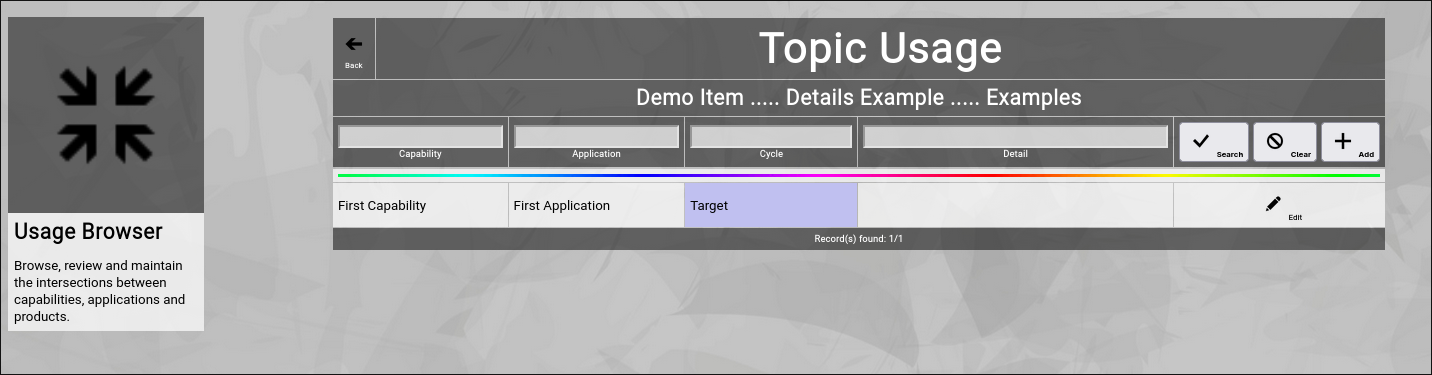
(Zingoolarity topic usage screen with a recently added usage)
And you will also see the "rainbow bar” again, marking the link which you just edited.
This is helpful if there are already many links for the given topic.
The screen will scroll to the last edited link and will highlight it with the "rainbow bar”.
Editing an existing Usage
You will also see the "Edit” button next to each and every usage.
Clicking this button will allow you to switch to the usage editor screen again to make some modifications.
Filtering the Topic Usage
In general, the usages are sorted in alphabetic order of the lane, domain, capability and application.
If you already have many usages added, it might be helpful to additionally filter.
You can enter:
- Part of a "Capability"
to search for the name of a capability.
- Part of an "Application"
to search for the name of an application.
- Part of a "Cycle"
to search for the name of a cycle.
- Part of a "Detail”
to search for a keyword in the details of the usage.
You may click on the "Search” button to perform the filtering or click the "Clear” button to remove a currently active filter again.
Going Back to the Topic
You can click the "Back” button in the upper-left corner to return to the previous screen (in this case, the topic editor screen). |
| Matching an Invoice to a Budget |
|---|
Matching an Invoice to a Budget
You have potentially learned about the concept of "Budgets” already, when we discussed the topic editor screen.
Zingoolarity allows you to optionally associate a budget with any topic.
To do so, you just have to enter something in the budget matrix in the topic editor screen:

(The budget matrix in the Zingoolarity topic editor screen)
As soon as you do so, "totals” will also appear in the different views (contextchart, kanbanboard and roadmap).
But having just a budget is not good enough to manage the outcome.
You also need to associate real spendings with your budgets.
And it is tremendously simple to do so in Zingoolarity:
You just create topics which represent your real spendings.
You can for example add one or more topic types for this (for example "Invoice”).
So whenever you receive an invoice from a supplier, you create a new topic somewhere in your Zingoolarity instance (this is completely flexible; you could create a topic hierarchy to contain invoice topics by month or you can create a container topic inside of each project or product topic to hold the incoming invoice topics it is completely up to you).
So let us assume that the current topic you are editing represents an invoice and you now want to match this invoice to a budget.
You can switch to the matches associated with a topic by clicking the "Matches” button inside of the topic editor screen.
Initially the screen will be empty and will look something like this:
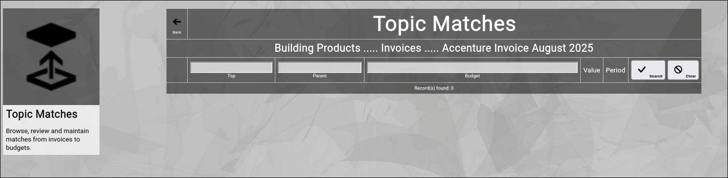
(Zingoolarity topic matches screen)
This screen works a little bit different compared to the other screens you have already encountered in the context of the topic editor.
You will notice that there is no "Add” button.
This is because the screen is actually already a search screen.
You can enter part of the name of a
- Budget
if you already know the name of the budget to which you want to match the invoice.
- Parent
which might be a budget category or the name of a project or product.
- Top
which is the name of a topic above the projects or products.
Here is an example, assuming you received an invoice from your consulting provider "Accenture” and you know that you have planned a dedicated budget for Accenture:
(Zingoolarity topic matches screen while searching for "Accenture” budget)
You now click on the "Add” button next to the budget:
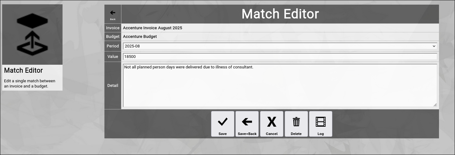
(Zingoolarity match editor screen)
This will create a new match between the invoice topic and the budget topic.
You additionally update the following fields:
- Period
Select the appropriate budget period from the drop-down box.
You can learn how to maintain your individual periods by looking at the "Using the Periods Browser” chapter further down in this getting started guide.
- Value
Enter the value in currency of the invoice to be matched.
This is usually the full amount stated on the invoice.
In some cases you want to split the invoice over multiple matches.
Then you enter just a part of the total invoice value.
- Detail
You may add an optional explanatory detail to the matching of the invoice.
Much like the "Detail” of a topic it can manually contain HTML tags (for example a "
” tag to force a line break).
Much like in the topic editor screen, you have a selection of buttons to complete your input:
- The "Save” button will just save your match (without leaving the match editor screen).
- The "Save+Back” button will do the same but return to the previous screen.
- The "Cancel” button will just return to the previous screen (without saving).
- The "Delete” button will request confirmation, will delete the match and then will return to the previous screen.
- The "Log” button will show a historical transaction log of the current match (for auditing purposes).
When you return to the previous screen, you will see the match which you just added in the list of the matches:
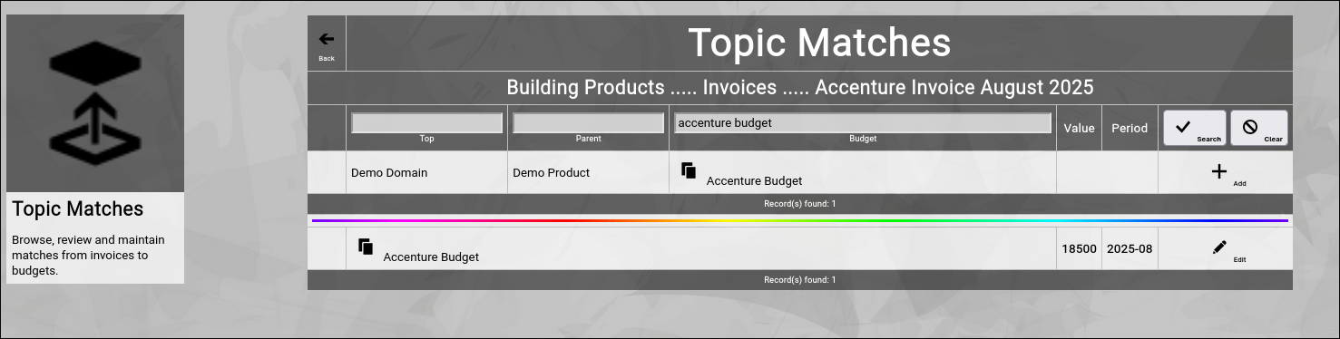
(Zingoolarity topic matches screen with the matched "Accenture” budget)
And you will also see the "rainbow bar” again, marking the match which you just edited.
This is helpful if there are already many matches for the given topic.
The screen will scroll to the last edited match and will highlight it with the "rainbow bar”.
Editing an existing Match
You will also see the "Edit” button next to each and every match.
Clicking this button will allow you to switch to the match editor screen again to make some modifications.
Sorting of the Matches
In general, the matches are sorted in period order of the matched budget.
Going Back to the Topic
You can click the "Back” button in the upper-left corner to return to the previous screen (in this case, the topic editor screen). |
| Exporting Topics |
|---|
Exporting Topics
Zingoolarity allows you to export topic branches (the current topic and all topics below the current topic, while considering multiple levels).
You can initiate and export by clicking the "Export" button inside of the topic editor screen.
Note that the "Export” function requires administrative privileges.
It will export the currently focused topic and all topics below the currently focused topic (independent of any "open” or "close” state of the topics).
In addition to the topic information, actions, teams, links and matches of every topic will also be included.
The export file is formatted in ZML and will be written to your local downloads directory as "export_topic.zml” or "export_topic.csv", depending on the export mode setting in the settings screen.
ZML is a simple tag-oriented format, much like HTML.
The export can also be edited manually with a text editor before importing it again somewhere else.
Here is a very simple example of a ZML file (only be beginning is shown):
[topic]
[id]f30619d232d742f0b65312f476e8dd8e[/id]
[name]My Project[/name]
[detail]This is an example project.[/detail]
[active]1[/active]
[percent]-1[/percent]
[duration]0[/duration]
[duration2]12[/duration2]
[url][/url]
[keyword][/keyword]
[recurse]0[/recurse]
[breaking]1[/breaking]
[teamonmap]0[/teamonmap]
[seclocks]all.r[/seclocks]
[sort]0[/sort]
[forceview][/forceview]
[showdetail]0[/showdetail]
[width][/width]
[height][/height]
[style][/style]
[forcenewrow]0[/forcenewrow]
[parentid]undefined[/parentid]
[timingid]undefined[/timingid]
[timingid2]202405[/timingid2]
[typeid]undefined[/typeid]
[stateid]undefined[/stateid]
[userid]undefined[/userid]
[ownerid]00000000000000000000000000000000[/ownerid]
[avatarname][/avatarname]
[avatarfile][/avatarfile]
[avatar][/avatar]
[/topic]

[topic]
[id]dd85394466e14c86a4f4b89fbc8e376d[/id]
[name]Project Preparation[/name]
...
If you are an administrator in Zingoolarity, you can also import such a file again in another Zingoolarity instance.
An export file can also function as an "offline backup” of an entire map and can be imported again as a "restore”, if disaster strikes. |
| Summary Report |
|---|
Summary Report
The "Summary Report” function can be invoked by clicking on the "Summary” button in the topic editor screen.
It will render a simplified summary of a topic tree, including the actions, which were used to document the progress.
In that, it will strictly follow the hierarchy of the topics and will only render the level of topics below, if the topic has been opened.
The sorting is similar to the sorting of the roadmap view mode.
Here is a very simple (artificial) example, shown in Roadmap view mode:
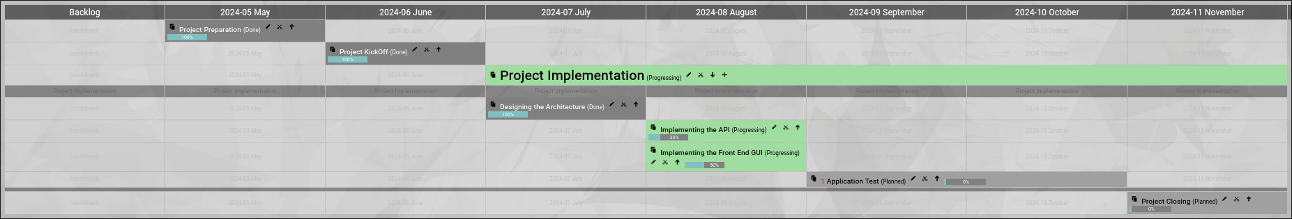
(Artifical example of a project roadmap)
The example basically represents a small project, starting in May 2024 and ending in November 2024.
The "Project Implementation” topic has a couple of topics below, which detail the implementation phase.
This topic is also "open”.
It will produce the following view, when the "Summary” button is clicked:
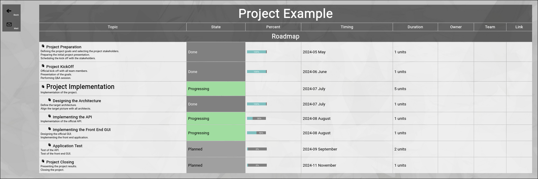
(Summary view of the example project)
You can use such a view to present a structured status report in a meeting.
By default, all actions are rendered in the summary report.
You can use the filter bar in the screen before invoking the summary to set a starting date, so that only actions since a given date are included in the summary report.
"Back” button
You can click the "Back” button to return to the previous screen.
"Mail” button
You can click the "Mail” button to send the summary report to your own email account (formatted as an HTML email).
From there you can forward it as an "offline status report” to any number of people. |
| Viewing the Transaction Log |
|---|
Viewing the Transaction Log
Each an every editor screen in Zingoolarity contains a "Log” button.
This allows you to view the integrated automatic transaction log for the data object in context.
The transaction log records every data change for a given data object for auditing purposes.
It will never be physically deleted.
It will only become unavailable for access by the Zingoolarity app, if the associated object is being deleted.
Nevertheless the data is still available for forensic purposes and can be analyzed by system level administrators should the need arise.
A typical transaction log (in this case for a topic) looks like this:
(Example of a Zingoolarity transaction log screen)
It shows who changed what and when.
Going Back to the Topic
You can click the "Back” button in the upper-left corner to return to the previous screen (in this case, the topic editor screen). |
| Using the Contextchart View |
|---|
Using the Contextchart View
You already learned in "The Main Shortcut” chapter, that the "Contextchart” is the default view mode for topics in Zingoolarity.
It is basically a hierarchical view of "boxes within boxes”, which can be customized in a mixture of horizontal and vertical alignment.
Here is a very simple example:
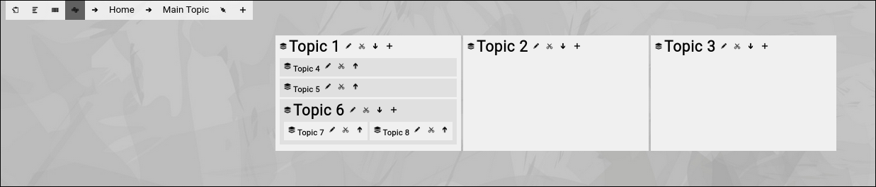
(Example of a contextchart view in Zingoolarity)
- We have focused on "Main Topic”.
- "Main Topic” contains 3 topics, which are horizontally aligned.
- "Topic 1” again contains 3 other topics, vertically aligned.
- "Topic 6” contains 2 topics, again horizontally aligned.
So what else do we see here?
On top you see the so-called "breadcrumb”:

(Example of the Zingoolarity breadcrumb)
The left part of the breadcrumb consists of four buttons.
The first button allows you to toggle between normal mode and presentation mode.
The other buttons allow you to switch between the different view modes:
- Roadmap view
- Kanbanboard view
- Contextmap view (currently selected)
The right part of the breadcrumb shows a hierarchy of topics, each topic consisting of a leading small arrow and the name of the topic.
Clicking on the name of the topic allows you to "focus” on the topic.
This is an easy way to "navigate up” in a hierarchy of topics (or to refresh the screen, if you click on the right-most topic, which is the topic currently in focus).
Clicking on the leading small arrow in front of a topic invokes the topic editor screen for this topic.
This allows you to quickly edit any topic in the hierarchy up to the "Home” topic.
At the end of the breadcrumb you will find the bookmark and the add buttons.
They will be explained later.
Below the breadcrumb, the real rendering as a "Contextmap” takes place.
All topics below the currently focused "Main Topic” are rendered as "boxes within boxes”:
(The "boxes within boxes” pattern of the Zingoolarity contextchart view mode)
Each topic has a small little "card stack" or "yellow sticky” icon next to it (depending on the iconset used).
This is the "signature icon” for a topic.
If the topic has a binary attachment uploaded, which is a picture (a file ending with .jpg, .png or .gif), the picture is rendered as an icon instead.
Next to the icon, the name of the topic is rendered.
The names of "closed” topics (which have a little arrow button pointing up next to them) are rendered in "normal size”.
The names of "open” topics (which have a little arrow button pointing down next to them) are rendered in bigger size (in our example above, this is "Topic 1” and "Topic 6”).
You can click on these "arrow buttons” to either open or close a topic.
Note that these buttons are only visible, if you have at least "write” level access to the topic.
This is because "open” and "close” is an attribute of the topic and the opened or closed state of a topic will be updated in the topic and visible to everybody else.
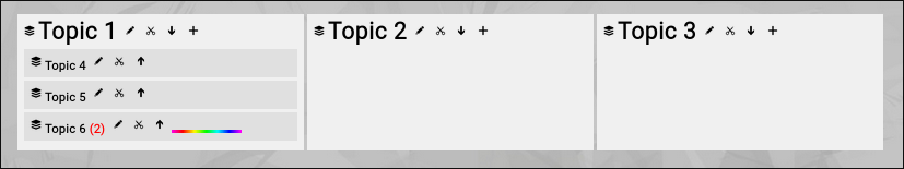
If you close for example the "Topic 6” in above example, the screen will look like this:
(Zingoolarity contextchart with a closed topic)
The topics inside of "Topic 6” are no longer rendered.
Instead, a small red number in brackets shows how many topics are directly below the currently closed topic.
And you will also note the already explained "rainbow bar”, which indicates the topic, on which you performed the last action (in this case, closing it).
Immediately next to the name of every topic, you will notice the "Edit” button.
This allows you to invoke the topic editor screen to make modifications on the topic.
And immediately after that, assuming that you have at least "write” access level to the topic in question, the "Cut” button (a little scissor) is visible.
If you click this button, the topic will be immediately cut to your own personal clipboard for later pasting it into a different location on the map.
If you have opened a topic, there is also an "Add" button to the right, assuming you have at least "write" access to the topic.
This allows you to not only insert a new topic below the currently focused one, but add it directly below a certain (opened) topic.
Clicking on the name of a topic on the map will focus on it (in the same way as already explained for the breadcrumb).
This is the equivalent of "navigate down” on the map and focus on the details.
If you do so on closed topics, the details become visible (even if the topic is still "closed”):
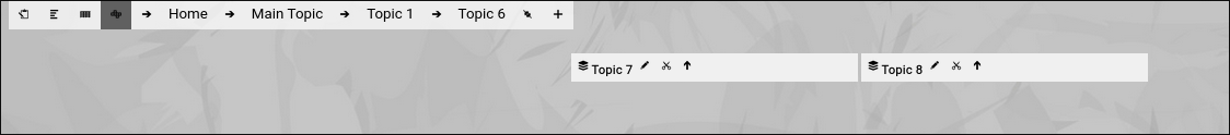
(Drill down into a Zingoolarity topic)
You can use the breadcrumb on top to navigate back (as already expained). |
| Using the Kanbanboard View |
|---|
Using the Kanbanboard View
We already had a look at the Contextchart view mode in the previous chapter.
The Contextchart view is, simply speaking, a rendering of topics as "boxes within boxes” (depending on the parent of each topic), with the ability to individually influence rendering on horizontal or vertical alignment.
In contrast, the Kanbanboard view primarily sorts the topics by their states and aligns them horizontally, in clearly identifiable columns:
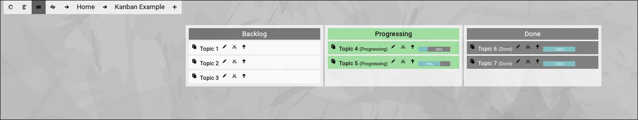
(Example of the kanbanboard view in Zingoolarity)
Topic which do not have a state yet, are rendered in the "Backlog” column.
All other aspects of the Kanbanboard view are identical to the Contextchart view.
You can dynamically switch between the different views by clicking on the buttons on the left side of the breadcrumb.
Kanbanboard within Kanbanboard
You can dynamically drill into one of the tasks on the Kanbanboard and directly use the task as another (Sub-) Kanbanboard, if the need arises.
Overall, you can use any topic anywhere in topicspace as a Kanbanboard without any preparation.
This is a key strength, as you do not need to setup a lot of complicated things; just go ahead and focus on the content.
For what can you use the Kanbanboard view?
The Kanbanboard is a good way to track simple tasks, which are not planned on long-term scale (for example for ToDo lists).
It is a good practice for periodic quick planning together with a team by
- reviewing the state of running topics,
- completing tasks after checking the results,
- moving tasks from the backlog to "running” for the next cycle (e.g. a week).
As soon as you need more "planning ahead”, the final Roadmap view mode is the right choice.
The Roadmap view mode is explained in the next chapter. |
| Using the Roadmap view |
|---|
Using the Roadmap view
The Roadmap view mode is a little bit different compared to the other two view modes and needs a little bit more preparation to produce meaningful results.
First of all, you have to create a topic which represents the roadmap itself.
In the following example, we will call it "Product ABC Roadmap”.
In the topic editor screen, locate the part which is called "Subtopics Timeline”, which is located near the end of the screen:

(Subtopics timeline section in the topic editor screen)
From the "Timeline” drop-down box of the "Subtopics Timeline” select the starting period.
In our example we select the January of 2024.
This implicitly defines the granularity of your roadmap, too (as you selected a month, your roadmap granularity will be "month”).
Next, select a "Span” of 12 units, as our roadmap initially will cover 12 months.
Note that "units” refer to the granularity which was implicitly defined when you selected a month for the timeline.
Now click the "Save” button and have a look at the "Subtopics Timeline” section again.
You will notice that the "End” automatically has been calculated, based on our (starting) "Timeline”, the implicit monthly granularity and the number of 12 units.
This is shown in the screenshot above.
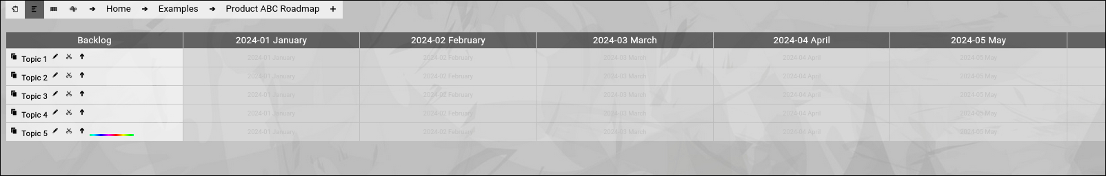
Now click the "Save+Back” button to return to the previous screen and focus on the newly created roadmap topic (and make sure that you switch to the "Roadmap” view mode):

(Example of a configured empty roadmap view mode in Zingoolarity)
Just below the breadcrumb, you will see the roadmap banner.
The roadmap banner usually starts with "(undefined)” (which can be seen as a backlog of not yet planned items) and after that you will see all the 12 months (based on your previous configuration of the roadmap topic).
When you scroll to the right, you will notice a couple of empty unlabled slots.
This is just "buffer space”, in case you plan something which starts in December 2024 and lasts for 3 months:

(Unlabled "spare” slots in the roadmap view)
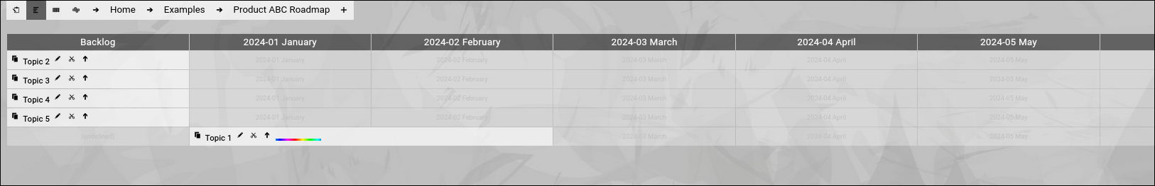
Now we add our first topic by clicking the "Add” button in the breadcrumb.
For the moment, we, just set the name and click "Save+Back” afterwards.
The result will look like the following:

(Example of a Zingoolarity roadmap view with a newly added topic)
This already looks familiar; much like the other view modes in Zingoolarity.
Note that the new topic is placed in the "Backlog” column, as we have done nothing more than giving it a name.
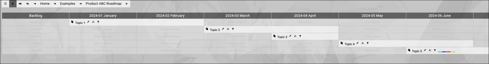
Now we add 4 more topics:
(Example of a Zingoolarity roadmap view with 5 added topics)
You will immediately notice, that the topics are ordered alphabetically by default, as we have not yet provided any additional information.
Now we edit the "Topic 1” and locate the "Topic Timing” section.
Be careful; it looks much the same as the "Subtopics Timeline”; do not confuse the two:

(Zingoolarity topic timing section)
In the "Timing” field we select "January 2024” and in the "Duration” field we select "2 units”.
After clicking the "Save+Back” button again, the picture will now look like this:
(Example of a Zingoolarity roadmap view with one topic having an assigned timing)
The "Topic 1” has moved to the bottom of the list, is now placed in the "January 2024” column and spans over two columns, also covering "February 2024”.
This already looks a little bit more like a roadmap already.
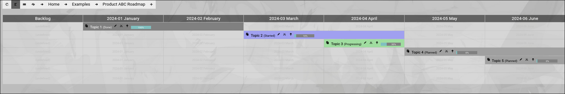
After having edited the remaining 4 example topics, the picture will look like this:
(Example of a Zingoolarity roadmap view with all topics having an assigned timing)
Now things are already assembled on a timeline.
If you add two more topics, call them "Last Topic" and "Final Topic" and place them on the same timing, you will notice that the "Final Topic" is on top of the "Last Topic”.
This is because sorting is still alphabetic, after the "Timing” of a topic has been considered:
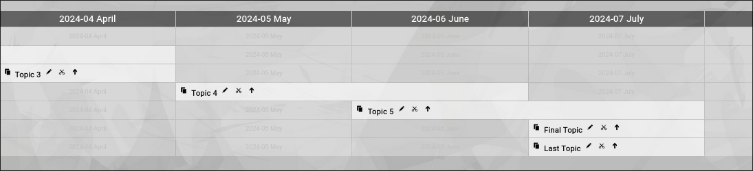
(Example of a Zingoolarity roadmap view with alphabetic sorting)
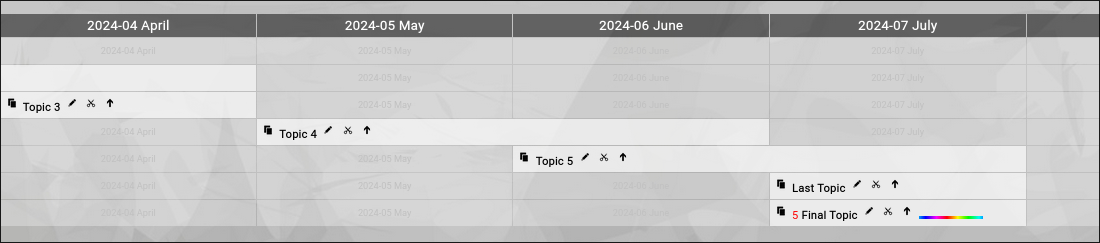
You can now influence this by for example setting the "Sort” of the "Fifth Topic” to 5 (any number larger than the default of 0).
Now the sorting will be overridden:
(Example of a Zingoolarity roadmap view with adjusted sorting)
And now we add some example "States” and "Percentages” to the five topics:
(Final view of the example roadmap view with added states and percentages)
You see, that you can use everything you have learned with the other view modes, also in the Roadmap view mode.
You can even apply the logic of "open” and "close” of a topic.
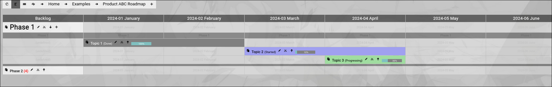
Let us assume that you have two phases in your roadmap.
We simply add "Phase 1” and "Phase 2” topics to the roadmap, cut everything which is already there in two steps to the clipboard and paste it into the appropriate phase topics:

(Introducing two phases to our example roadmap view with topics already cut & pasted)
You can now dynamically open and close the two phases (or, if you prefer, drill into them):
(Opening one of the phases of our example roadmap view)
Again, this gives your roadmap more structure and the ability to focus on the different phases.
And last but not least, there is the capability to use any of the topics on the roadmap as a kind of "sub roadmap”.
Let us open the "Topic 2” and add two more topics below:
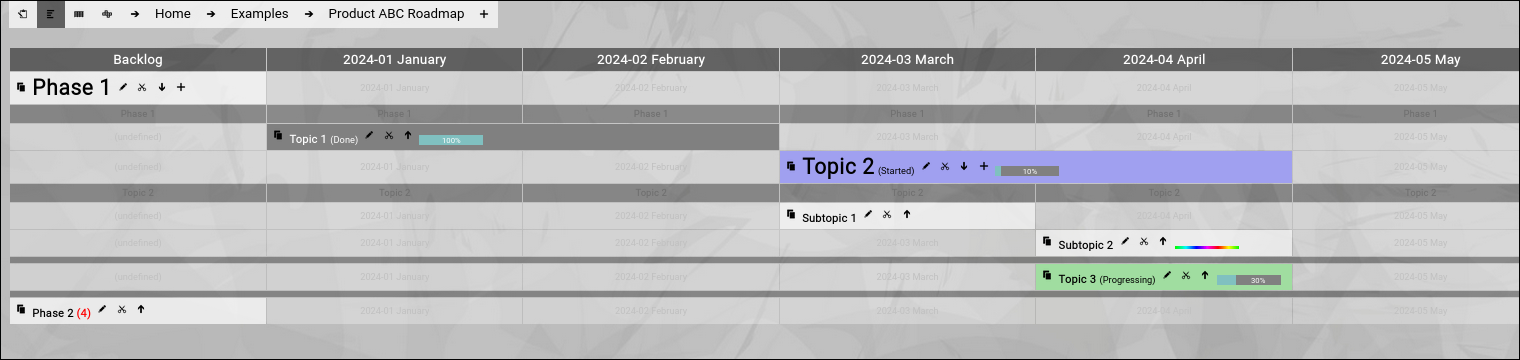
(Introducing the concept of sub roadmaps to our roadmap view)
"Open” and "close” automatically use the same rendering timeline as the currently focused "Product ABC Roadmap” topic.
If you do not intend to open+close the topic but drill-into the topic instead, it is even possible to use a different timeline (of the same or of different granularity) for the "sub roadmap”.
For that you simply set a different "Subtopics Timeline” for the topic which functions as a "sub roadmap”.
This allows you for example to set a "Subtopics Timeline” timing of "Calendar Week 30” with a span of "8 units”.
As soon as you drill into our "Topic 2” (with the modifications above), you will see something like this:

(Having drilled into the sub roadmap with a different granularity)
Mixing Granularities
There is one caveat with this approach.
If you have already set a timing for the two topics below the "Topic 2” (for example "March 2024”), you will no longer see these topics when you switch the "Subtopics Timeline” timing to calendar weeks.
This is because the roadmap view mode will only show the topics which fit the range of the specified "Subtopics Timeline”.
To correct this, you can temporarily switch to the Contextchart view mode and edit each topic to adjust their timeline either to "(undefined)” or to a proper setting in range.
Or you can use is intentionally, as you want to see two topics on the overall roadmap and when you drill down, you want to see a more detailed breakdown into calendar weeks.
Summary
To sum it up, the Roadmap view mode is capable of rendering even complex multilevel roadmaps, while still providing all the basic features of the other view modes.
You can even jump in granularity during drill down, but this is indeed an advanced approach.
We want to mention one final (probably interesting) capability here:
You can even mix the timing granularity of different topics below one single topic.
You may start with a monthly granularity (and set this as the default "Subtopic Timeline” in the topic which represents the roadmap or the sub roadmap.
Then you start using the Filter bar (which will be explained later) to override to calendar week granularity and add additional topics with the calendar week granularity.
Clearing the filter will switch back to the default monthly view; setting a manual filter again will make the calendar week topics appear again.
And now it is time for you to dive into planning and using roadmaps yourself.
Have fun. |
| Topics on the Map |
|---|
Topics on the Map
Topics are rendered in the three different views nearly in the same way.
Here is an example with most of the possible information present:
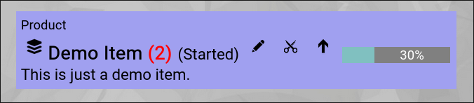
(Example of a topic rendered on a map)
- In the upper-left corner, the type of the topic is shown (a "Product” in this example).
- Just below, the signature "stacked cards" or "yellow sticky” icon is shown (the default icon for a topic).
If the topic would have an image file as an attachment (=avatar), then the image would have been rendered instead.
- Just right of it, the name of the topic is shown.
- Right after the name, in brackets, the state of the topic is rendered.
Note the blue color of the topic box; this color is associated with the "started” state.
- Right after the state, the "Edit” button is visible.
It will invoke the topic editor screen to view more details or make changes on the individual topic.
- Right next to it, the "Cut” button is visible.
It will cut the topic to the personal clipboard for later pasting it somewhere else on the map.
This is only visible, if the user has at least "write" access to the topic.
- Right next to it, the "Open” or "Close” button is located (arrow down or arrow up).
It allows you to open or close the topic.
Closed topics optionally show the number of included topics inside in red.
Open topics render their content inside the topic box.
- Right next to it, the "percentage bar” can be seen.
It appears as soon as you set the estimated completion percentage of a topic.
- Just below, assuming you have activated the "Show Detail” option of the topic, the "Detail” is rendered as text.
In this view, the text is stripped of any HTML formatting to save space.
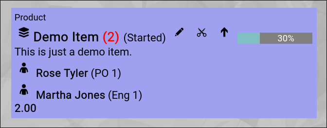
Adding a Team Member
As soon as you add persons to the team of the topic, they will also be rendered on the map, assuming that you have activated the "Team on Roadmap” option of the topic and the settings allow the rendering of teams in general:
(Example of a topic rendered on a map with an added team members)
Team members will be shown with the following attributes:
- Avatar
Either a default icon or an attached avatar image will be shown.
- Name
The name of the person in the team.
- Role and FTE
In brackets, the role of the person in the team and the allocated FTE will be rendered.
At the bottom of the team member list, the number of total FTEs will be added up.
Budget View
As soon as you enter a budget in the budget matrix of a topic, the budget matrix will be automatically shown in the topic box:
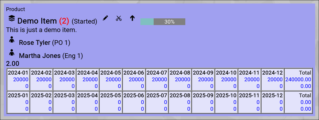
(Example of a topic rendered on a map with an added budget)
Automatic Totals
As soon as you have a team with FTE rendered, you will see total FTE information on every level of the topic hierarchy.
The same goes for budgets; as soon as one topic on the map has a budget, totals will be rendered on every relevant level.
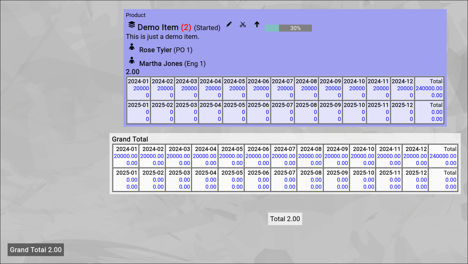
(Example of a topic rendered on a map with an added budget)
Link View
(to be added)
Capability View
(to be added)
Application View
(to be added)
Usage View
(to be added) |
| Cut and Paste |
|---|
Cut and Paste
In practice, while designing topic maps, it often happens that you want to move a number of topics from one location to another location.
Naturally you could change the parent of each topic manually with the help of the topic edit screen, but this is neither efficient nor intuitive.
Therefore it is possible to directly cut a number of topics from any position on the map to your personal clipboard (with the intention to bulk-paste them all later into another topic somewhere else on the map).
(the "Cut” button looks like a "little scissor”)
What is the "personal clipboard”?
Technically, the personal clipboard is a special topic named "Clipboard [your name]”, which is created automatically on-the-fly, as soon as you use the cut functionality for the first time.
Your personal clipboard is only visible to you (as the owner) and it is created below the "Clipboard" topic.
When you cut a topic on the map, the parent of the topic in question is set to your personal clipboard, which effectively "moves” the topic to this special topic.
Pasting the clipboard content
As soon as something is in your personal clipboard, the breadcrumb on top of the map will show the new "Paste” button and the number of topics in the clipboard in RED:

(The breadcrumb with the new "Paste” button)
You can now navigate to the desired new location on the map.
If you now click the "Paste” button, the clipboard content will be pasted into the currently focused topic. |
| Global Search |
|---|
Global Search
The global search functionality is directly available from the right side of the top level menu bar:
(Zingoolarity global search area in the topc level menu bar)
You just need to enter a search phrase in the "Search” field and hit the "Search” button to start the search.
The Global Search will try to locate the entered phrase in the names of the following Zingoolarity data objects:
- Users
- Topics
- Types
- States
- Roles
This allows you to search for any of the above things in a uniform and simplified way.
You can for example enter part of a user name (e.g. "rose”) to locate the matching users.
Or you can for example enter "po” to lookup the details of the product owner role.
Here is an example output for search phrase "rose”:
(Example global search result of searching for "rose”)
And here is another one for search phrase "cpo”:
(Example global search result of searching for "cpo”)
You can either click on the name of a data object or on the "Edit” button to invoke the related object editor screen.
The exception is the "topic data object”:
If you click on the topic name, it will by default invoke the Contextchart view with focus on the topic.
From there you can easily switch the view mode to something else (e.g. Roadmap view mode).
More detailed search
The global search function is provided for quick and easy casual search.
You can use the different Zingoolarity data object browsers (explained further down in this getting started guide) if you need more object-specific filtering capabilities. |
| Filtering your View |
|---|
Filtering your View
We have already mentioned the "Filter” bar before in the chapters about the different available view modes.
The filter bar is available on top of the screen in all three view modes, if you enable it in the settings screen:

(The Zingoolarity filter bar)
Using the filtering capabilties
The first six fields provide filtering capabilities, which directly affect the rendering of the topics on the three different view modes:
- From and To
Here you can select a starting and ending timing.
The "(undefined)” choice means that no filter is set.
In the Contextchart and Kanbanboard view modes, these two settings optionally filter which topics are rendered below (the timing of the topic must fit into the range).
In the Roadmap view mode, these settings override the "Subtopics Timeline” set in the currently focused topic.
If your roadmap for example has a "Subtopics Timeline” setting of "January 2024” and "12 units”, you can for example set "March 2024” and "May 2024”.
This will override the start and the 12 months and will only render 3 month starting with March 2024.
- Active
This allows you to optionally filter for only active or only inactive topics.
- Width
By default, topics rendered as boxes have a minimum width of 256 Pixels.
Here you can adjust this width, if you want to provide more space for each topic.
Note that if topics contain other topics and they are open, the width may be automatically larger than the preset width to make room for the topics within.
- Linked Type
This setting is relevant if you activate the general rendering of links in the different view modes.
You can activate the rendering of links in the settings (upper-right "Settings” button in the top level menu bar).
By default, all linked topics are rendered.
If you only want to see a single type, you can enter part of the type name here to filter for it.
- News Since
Some views in Zingoolarity also render the actions associated with the topics (most prominently, the summary screen, which is also explained in this chapter).
By default, all actions are rendered.
If you enter a starting date here, only actions starting from this date onwards are rendered.
This is helpful, if you only want to provide the actions of -for example- the last week.
Click the "Search” button to set the selected filters.
Click the "Clear” button to reset all filters to their defaults (effectively disabling the filters). |
| Using Personal Bookmarks |
|---|
Using Personal Bookmarks
The "Bookmark” function can be invoked from the breadcrumb (which is present in all of the three view modes) for the currently focused topic by clicking on the "Bookmark” button.

(Zingoolarity breadcrumb with bookmark button)
The currently focused topic will be added to your personal bookmarks for later quick pick.
This is for example helpful if you have a couple of projects (or similar) or you have created a personal workspace with a ToDo list, which are all spread over different levels and different branches of the topic hierarchy tree.
If you bookmark the currently focused topic, the button will change into the "Unbookmark” button, which (as the name implies) allows you to directly unbookmark the currently focused topic again.
To pick a topic from your personal bookmark list, invoke the "Bookmarks” from either the main menu or from the home page:
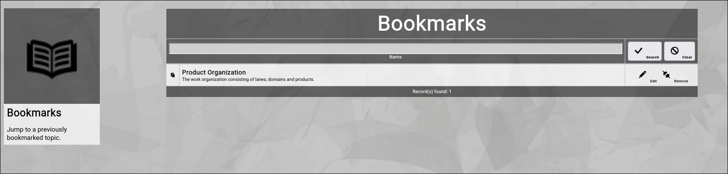
(Zingoolarity personal bookmarks screen)
In this screen you have multiple options:
- Filter the list of bookmarks by part of their topic names.
Enter part of the name of a bookmarked topic and click the "Search” button.
To remove the filter again, click the "Clear” button.
This is helpful if you have already bookmarked many topics.
- Focus on the bookmarked topic.
Click on the name of the topic (in the left part of the list) to switch to the Contextchart view of the topic.
This is the main purpose of the bookmarks screen.
- Directly edit a topic.
Click on the "Edit” button right of one of the bookmarked topics.
This will invoked the topic editor screen (and will return to the bookmarks screen when you are finished).
- Directly remove a bookmark (= "unbookmark” the topic).
Click on the "Remove” button right of one of the bookmarked topics.
As this is not a critical "delete” operation, the bookmark will be removed without further confirmation.
|
|